Water level measurement comparison plot
Accurate hydrological data forms the critical backbone of effective environmental management, sustainable agriculture, and municipal flood mitigation. When tracking dynamic aquatic systems, relying on a single data source can leave researchers vulnerable to sudden equipment failure, biofouling, or extreme environmental anomalies. That is exactly why generating a comprehensive water level measurement comparison plot is considered an indispensable best practice. By visualizing temporal data from multiple instruments side-by-side, professionals ensure superior accuracy, easily spot hardware malfunctions, and maintain unwavering confidence in their predictive hydrological models.
Understanding the Core Components
A rigorous water level measurement comparison always begins with selecting the appropriate hardware. Modern hydrology relies heavily on an array of distinct water measurement devices to track surface and sub-surface changes across widely varying terrains. From acoustic transmitters mounted on elevated bridges to submersible probes resting directly on riverbeds, each technology interacts differently with its surrounding natural environment.
By utilizing visual hydrograph analysis techniques, hydrologists can effectively map these diverse data streams onto a single, cohesive timeline. A standard comparison plot typically features time on the X-axis and the water stage on the Y-axis. This visual overlay empowers analysts to execute rapid assessments of seasonal trends and unexpected discrepancies. Whether managing complex groundwater monitoring well instrumentation for an agricultural district or observing a fast-flowing river, deploying diverse water level sensors establishes the ultimate foundation for robust data collection.
The Value of Multi-Sensor Validation
New technicians often ask why compare ultrasonic and pressure sensors instead of simply deploying two identical units for redundancy. The core answer lies in their fundamentally distinct operational mechanics. Ultrasonic and radar devices operate as non-contact surface water depth sensors. They emit sound or radio waves that bounce off the water's surface, making them highly immune to submerged debris and corrosive chemicals, though they remain somewhat susceptible to extreme temperature gradients.
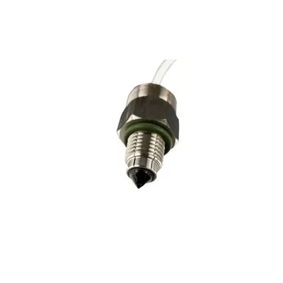
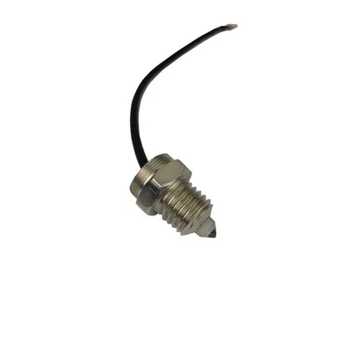
In stark contrast, submerged pressure transducers sit securely beneath the water's surface, calculating total depth based on the hydrostatic weight of the water column above them. While excellent for long-term deployment, their readings can occasionally be skewed by severe barometric pressure shifts or heavy sediment burial.
When evaluating radar vs pressure transducer accuracy, plotting their respective datasets together reveals environmental influences that might significantly distort a solitary reading. This dual-technology strategy is fundamentally vital for multi-sensor validation for flood monitoring. During severe weather, a false reading could dangerously delay life-saving emergency responses. By cross-referencing different technological paradigms, data analysts can establish highly dependable environmental data benchmarking methods that easily hold up against intense academic and regulatory scrutiny.
Best Practices for Constructing the Plot
Creating a highly functional plot requires meticulously clean data and precise temporal alignment. The very first operational step involves utilizing automated datalogger synchronization for reporting. If independent devices are not continuously recording on the exact same timestamp, comparing their analytical outputs quickly degrades into a frustrating guessing game. Once correctly synchronized, you can confidently import the raw telemetry data into your preferred analytical software.
Essential Data Cleaning Techniques
Filter Out Transient Anomalies: Analysts must focus heavily on eliminating noise from hydrological time-series graphs. Heavy wind events or floating debris can trigger microscopic spikes in non-contact sensors. Applying a standard moving average filter smoothly erases these distractions without altering the underlying data curve.
Manage Equipment Deterioration: A historically common challenge involves properly correcting sensor drift in data plots. Over an extended deployment, algae accumulation on a pressure transducer can slowly alter the instrument's baseline reading. Regular manual field calibrations should be visibly marked on your comparison plot to logically adjust historical data points.
Incorporate Critical Flow Metrics: Take your environmental analysis a step further by plotting multiple stage-discharge curves alongside your primary depth comparison. This multidimensional approach provides stakeholders with a much fuller picture of how total water volume and vertical height interact dynamically during storm surges.
Decoding the Data: Analysis and Interpretation
Once your customized graph is generated, mastering how to interpret overlapping water level readings becomes your most critical skill. In a flawless scenario, the undulating lines representing your assorted sensors will perfectly mirror one another. In reality, minor systemic divergences are entirely normal.
Analysts must consistently look for stable offsets as opposed to sudden, erratic deviations. If a bridge-mounted radar sensor consistently tracks two inches higher than a bottom-mounted pressure transducer, you are simply observing a basic spatial calibration offset. Conversely, if the submerged pressure transducer's readings suddenly spike while the non-contact gauge remains entirely steady, you might be dealing with rapid sediment burial. Calculating the statistical correlation of varying depth gauges using metrics like the Pearson coefficient allows you to strictly quantify these relationships. A high statistical correlation ultimately confirms excellent overall system health.
Transitioning to Live Interactive Dashboards
Historically, complex comparative plots were only generated post-event during retrospective studies. Today, the industry focus has forcefully shifted toward the unparalleled real-time hydrological data visualization benefits. By instantly transmitting remote field data through cellular telemetry directly to cloud-based servers, progressive organizations are seamlessly creating comparative water level dashboards.
These live-updating dashboards allow regional stakeholders and emergency managers to continually observe a synchronized water level measurement comparison plot from anywhere in the world. If a primary field sensor unexpectedly fails during a catastrophic flash flood, the comparative dashboard immediately highlights the stark discrepancy in real-time. This automated transparency ensures operators can seamlessly shift their operational reliance to the backup gauge, thereby preventing catastrophic data gaps.
Conclusion
Developing a well-calibrated comparison plot is not merely an academic exercise; it is an absolute necessity for anyone seriously managing modern water resources. By intentionally combining diverse measurement technologies and consistently applying rigorous visual analysis, you permanently safeguard the structural integrity of your vital environmental data.